The Digital Storefront
An ecommerce company’s homepage is essentially the digital storefront. It is the anchor of a website. The type of industry will dictate how to layout the most effective design. Ultimately, you should clearly showcase benefits of your business and provide relevant information to new and returning visitors.
A well-designed homepage for mobile and desktop will positively impact trust, set expectations, and guide users through their journey to a purchase or taking a desired action.
What key Information should I have on my homepage?
Consumers may land on a homepage for a variety of reasons. They may have come directly by typing in the website URL, through a google search, from a paid advertisement. Therefore, it is crucial to differentiate your brand by clearly displaying a value proposition, an intuitive menu, benefits section, well-placed calls to action for contact, product, or services. Key information should be placed above the fold. “Above the fold” is content people see on a website before scrolling.
What is a Value Proposition on a homepage?
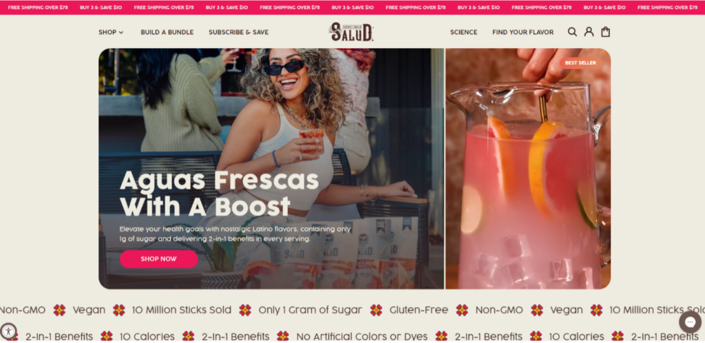
A value proposition explains a brand’s competitive advantage. It is a concise sentence that affirm your brand to returning users and give insight to new customers. This value proposition statement can speak to how does the product/service improve the customer’s situation. It also may show the expected benefits of the product’s impact, and how this product/service is different than the competition. The most impactful value proposition is front and center and supported with additional content.
What is Social Proof ?
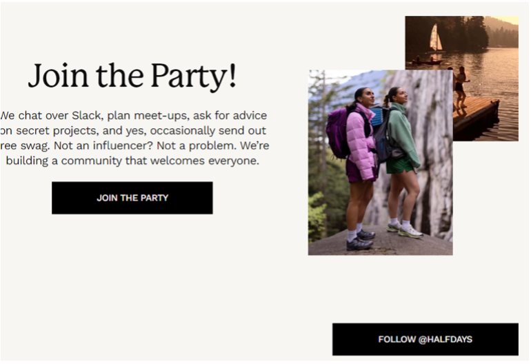
Leveraging both product reviews and broader customer testimonials. Well-placed testimonials in text or video can help alleviate concerns, build trust, and be a deciding factor in purchasing decisions. Social proof can come from high value customers, industry experts, local or national publications.
Where should I put Contact Information on a website?
Make contact information clearly visible to your customers. The navigation and the website footer are great places to put this information. Let us not forget the other elements that demonstrate site security: trust badges and SSL certificate. These signal trustworthiness to consumers and impact cart abandonment.
How to optimize the User Experience on a homepage
Ensure users have a great experience on the homepage by continually improving load speed, visual design, and personalization. Make it easy for users to navigate and find call to action buttons. However, do not distract them.
Keep the homepage design simple by avoiding visual complexity. Unnecessary copy, images, more color, and lights variations can give the user too much visual cues to track. Too much visual chaos ultimately makes a bad UX. The goal is to communicate effectively while using the least number of elements.
Why is homepage speed important to the User experience?
Let’s focus on speed. The faster the website the more likely that customers will convert. Since, just a few milliseconds of delay can reduce conversion it is important that the mobile version of homepage of your website loads quickly. Watch out for server performance impacted by too manly plugins, large image size, and older code structure. These are just a few of the things that may slow down a website and hamper conversion.
How to personalize a homepage?
Make users feel the website is tailored just for them with a personalized experience. Serve user product and category recommendations based of their previous browsing history. Another quick way to make a personalized experience is showcasing abandoned cart items to returning users.
The Buyer Journey Begins on the homepage
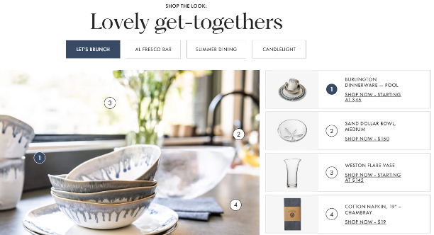
A clear path to purchase with calls to action that begin in the hero image is great way to guide users on their journey. These are homepage best practices that help convert sales.
- Ensure category pages easily sorted or filtered with a clear path to navigating through the site.
- Display product page reviews using high quality images.
- Mention or link to the return policy and offer delivery expectations
- Advertise free shipping option for the cost sensitive customer.
Whether to have a Hero image that is static, or auto-slide carousel is something that should be A/B tested. Some brands will have a hero image slider but also static elements. The hero image should have the value proposition along with main calls to action and trust indicators.
How should you style Calls to Action on a homepage?
Where should you place categories on a homepage?
Placing categories on the homepage can help mobile users. This helps them find product offerings without having to search in the menu. Feature your top products as well. They can be features as best sellers or seasonal. However, the key is to order them in a way to get the most conversions.
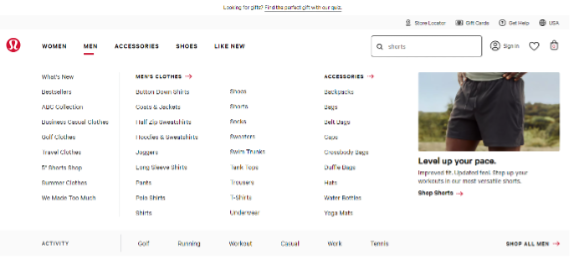
Best Ways to Design the Menu and Navigation
The destination categories and subcategories should be understood with clear names to avoid confusion. Overall, the navigation should be one of the most noticeable elements on the homepage. A mega menu with banners, box, or contrasting colors will help in this regard.
If your website is more product focused ensure that the transactional menu is visually prominent compared to the content menu. The transactional menu should be larger in size and can be placed front and center of the homepage or vertically down the left side of the page.
Be specific and descriptive with navigation labels so that visitors can understand where on the website they are. A poor navigation may lead to customer abandoning the website when they can’t find the product or page they want. It is important that homepage navigation is simple.
Onsite Search Optimization Tactics
Since more e e-commerce shoppers use mobile devices, it is essential to keep these searchers moving through the website. A menu should be smooth across devices. A great way to make it more effective is to include search bar along with a benefits/value bar, seen on every page. If your website has a large catalog, an optimized onsite search experience eliminates barriers between visitors and their desires.
Best practices for onsite search experience:
Basic On-site search helps users find the exact products on websites by matching keywords. However, an optimized On-site search will have more robust user experience features
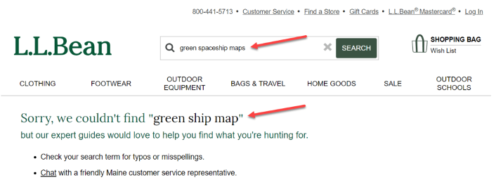
- Leverage the No Results Page. Show user alternative search suggestions, contextual category links, broader matching content, or details to contact support.
- Use AI to improve imperfect input by searchers. For example, manage numbers and special characters and allow for common misspellings and typos.
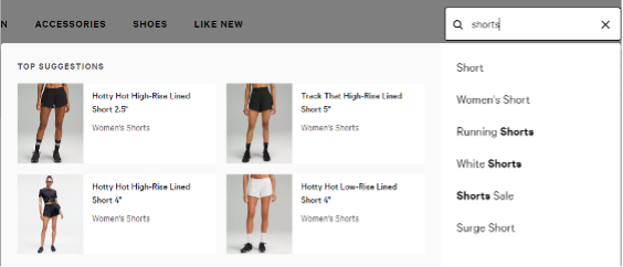
- Inspire Input and show faster results with Predictive Search. This will show result suggestions from the first character’s a user types in the search bar.
- Use Google Analytics search terms report to see what site visitors are searching and if the website is delivering results.
It’s important to have a clearly visible search box and optimized on-site search function. The Search Box is an element with potential to increase organic sessions, sitewide conversions and time spent on a website.
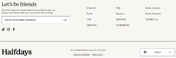
Important elements that make up a website footer
Be as transparent as possible with information in the footer of the website. Consumers are drawn to retailers and brands that are forthcoming with information tied to customer service. For example. the ordering process, shipping costs, return policies, guarantees, and warranties.
Website Footer Elements
- Display essential contact information, such as email address, phone number, and physical address, for customers seeking assistance or inquiries.
- Include a clear and enticing call-to-action (CTA) that leads users to complete desired actions, such as signing up for newsletters or exploring promotions.
- Payment and Security Icons displaying payment and security icons in the footer assures customers of a secure shopping experience.
- Offering a sitemap or site index in the footer will help users find specific pages quickly, especially if you have a larger ecommerce website. Lastly, ensure the footer includes links to accessibility statements, ADA compliance, and other relevant regulatory information.
Article Sources1234
Citations